![]()
When I set out to create a logo for Scandalous Shards, I didn’t want something neat, polished, or obvious. This isn’t that kind of project. Scandalous Shards is my after-dark creative playground — a space where I explore the bolder, messier, more provocative themes that don’t usually make it into my daytime, family-friendly work with schools and communities. The logo needed to reflect that — and it does.
At first glance, the new logo is moody and elegant: a deep navy blue background contrasted with gold lines that shimmer like veins in stone. But look again. People pause. They tilt their heads. “Wait… is that a vulva?”
It could be. But it’s also something more.
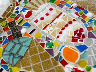
The motif is inspired by kintsugi, the Japanese art of repairing broken pottery with gold. Instead of hiding the cracks, kintsugi highlights them — celebrating flaws, history, and transformation. That felt exactly right for this project. Scandalous Shards is all about reclaiming what’s been fractured, labelled, or shamed — and turning it into something powerful, defiant, and beautiful.
The gold lines in the logo symbolize those “imperfections” — the emotional and societal cracks we carry, especially as women. The dark blue evokes a night-time shift, a creative mood that happens when the rules loosen and the real stories start to emerge.
And yes, the shape might suggest something anatomical. That’s deliberate. It invites the viewer to look again. To sit in the ambiguity. To question why certain shapes make us uncomfortable, and who gets to decide what’s obscene or sacred.
This logo isn’t just a visual identity — it’s a quiet act of rebellion. A wink. A glimmer in the dark. A reminder that art can be both beautiful and disruptive.
So the next time you see it, don’t just ask, “What is that?” Ask instead, “Why do I see it that way?” And welcome to the world of Scandalous Shards — where the broken becomes bold, and nothing is off-limits.